 Just playing around with color layering on this one, this is done with one plate (errr... two, top and bottom). I would like to do some more runs on it and am still considering trying it, but my paper was getting ripped apart. I ended up cutting the printed areas out and chine coleing them onto a different support. I learned some stuff on this one. Hopefully the Print Zero people won't mind if it's a little rough around the edges.
Wednesday, June 06, 2007
Print Zero Print
Just playing around with color layering on this one, this is done with one plate (errr... two, top and bottom). I would like to do some more runs on it and am still considering trying it, but my paper was getting ripped apart. I ended up cutting the printed areas out and chine coleing them onto a different support. I learned some stuff on this one. Hopefully the Print Zero people won't mind if it's a little rough around the edges.
Tuesday, May 15, 2007


Well I finally actually had a serious conversation about my art here with one of the painting profs. He had some interesting things to say, most notably that most students he sees view art as being illustrative, but when he looks at my stuff he sees the opposite he sees illustration being viewed as art. He says those other people need to look at classical art history and looking more externally, but he thought in my case I need to be looking at modern art and much more internally. These were some of the artists he recomended that I look at. The top two are by Klee, the other two are by Guston.
Monday, April 23, 2007
Patron Saint of Printing Presses
 St. Brigid of Ireland is the patron saint of printing presses, I am not quite sure why, it really didn't seem to fit into her story at all.
Monday, April 16, 2007
Snowing Again
We had another snow day today, it was snowing when I got up this morning at 8:00 am, and it is still going strong, very low visibility.
City Lights

Well last week was the day of the semester trip to New York, and my first time in NYC. I went off with my friend Amy (MFA ceramics) we ran through the Met, through the Natural History Museum. From there we took the subway to Greenwhich Village to meet up with her Aunt Ginie, we had a very good dinner at a small little restaurant. Then we took a taxi through rush hour traffic to only just barely make the bus back.
While at the Met we saw the Horse Fair by Rosa Bonheur, which was kind of exciting as we had just discussed that painting in history. Evidently Bonheur dressed like a man, and in fact had to have a special liscence to be a transvestite issued to her. Currently there is a theory out that her paintings were more than just horses, and that the unbearded youth in her paintings were in fact her (ie the figure that is almost dead center and is looking out at you)
Sunday, April 08, 2007
Thursday, April 05, 2007

Sunday, April 01, 2007

Friday, March 30, 2007
10 of Hearts

Ten of Hearts this one reminds me of circuses, but at any rate I tried taping some lace into my paper stencil to see if it would work to give a textural soft ground effect. I got some pretty good results with it.
Thursday, March 29, 2007
Thoughts
Today Dr. Partridge had me going through the questionaires/surveys from a guest lecture that she had sponsored. At first I was rather amused to find a survey from one of the Marywood proffs that read "It actually felt like a university for a day." I shared this with another MFA and we got a laugh out of it, but as the day progressed I started to become more and more bothered by this. After all the faculty are kind of like the DNA of the university, they are the ones who determine the character of the university and the students success is a direct mirror of the proff's abilities. This proffs statement raised the question that since this individual is such an integral part of the university then why aren't they doing something about it? Then I started to think about some of my own passive aggressive behavior, negativity, and about my work. Some of these thoughts centered back to the fact that the MFA's outside of their semester reviews do not really have group critiques. One of the adjunct profs had assigned us the task of trying to organize our own critique where we set the parameters last semester. The idea was met with tremendous negativity by a few people, it ended up lasting for six hours and was really a bit of a dud as far as critiques go, but rather than looking at what went wrong and learning and trying it again, the idea was dropped and ridiculed. Well I started thinking about something the Hoff had told me after looking at my work, that I'm a risk taker. I started thinking about that and I'm thinking about trying to set up another open critique thing.
Tuesday, March 27, 2007


Resolution and Compromise

 My weekly review with the Hoff went quite well today, he was happy with the king of clubs. And I was also able to present him with a compromise on a difference of opinion between us. Next semester I had wanted to start work on a very large multiplate dealing with some of the metaphors involved with Genesis. He had some serious issues about the size and the amount of time such a project would take. At anyrate I stumbled across the work of Louis-Marin Bonnet in Colorful Impressions: The Printmaking Revolution in 18th Century France. Marin was so proud of the color that he had achieved that he also made prints of each stage in printing, and gave a little bit of a written account for what he did for each print. As can be seen he did this print using only a la poupe techniques, and only one plate. The Hoff finds this method more acceptable, and he seemed pretty interested when I showed him the book.
Saturday, March 24, 2007
Cards


These are two of my silk screened cards. Peter wasn't overly crazy about the three of hearts, for technical printing reasons. My registration is a bit off in the king of clubs I don't know how acceptable that is to the rest of the world. The hearts is a four color registration print, and the king is a six color registration. Both were done using a combination of paper and photo stencils
Joel! You didn't show us the right way to handle a dust box!
"With the shelf out and the flap closed, the resin is shaken into suspension by swinging the whole box over one's head from side to side and then bringing the box down to the floor with a slight thump to prevent any granules from clinging to the sides. This action looks to the bystander like a herculean task...Besides, it is good exercise-which even artists need."
B.F. Morrow
The Art of Aquatint
Thursday, March 22, 2007
I dare say my temper is improving here
So I'm working on my silk screen stencils for my cards, and decided that some of my light weight chine cole paper could possible give an interesting effect in a paper stencil. So I go to my clearly labeled with my name drawer in the printshop expecting to be greeted by a bursting abundance of specialty paper, only to find my paper gone and nowhere to be seen in the room, in the grad studio, or even in the garbage cans, and somebody else's project in there, so I promptly threw it across the room. I might add the piece consisted of a masonite board with many half dollars glued on it, so there was a rather pretty shower of silver coins as it flew across the room. I imagine that I shall probably be hearing from the Hoff about this.
Monday, March 19, 2007
Guild Print

This is my guild print, every year the Hoff puts together a print guild, basically a big printswap that also includes a small show. This is mandatory for the MFA printmakers and also costs us $10. We pretty much have to give up the full edition, the university auctions off the extras and pockets the money. I might also add that the $10 is going to Marywood envelopes, which he can get for free, and $5 frames that he purchased years ago, and keeps reusing from show to show.
Monday, March 05, 2007
Ferric Chloride
Alright, I've been doing some research to try to find a way to refine the course bite of the ferric chloride. I may have found it. Ferric Chloride is also known as Edinburgh Etch, and research done in 1997 to try to eliminate the sediment created in the etching process also reputedly found a way to refine the quality of the etch to razorsharp exactness. And ba..ba..bum the magical mystery ingrediant is citric acid. I have yet to try it yet, but I plan on doing so shortly. The title should link up to the webpage where I found this info and much more, but if it doesn't this info can be found at: www.polymetaal.nl/beguin/mape/edinburgh_etch.htm
Monday, February 19, 2007
I think I was sleeping in History Class
Evidently I wasn't paying very much in history, this morning I caught the Planet of the Apes on the History Chanel.
Saturday, January 27, 2007
Card Project
Alright, among my project is designing playing cards based off the historical views of the rulers represented by the suits. Traditionally the king of hearts was seen as being Charlemagne, the king of spades Julius Caesar, king of Clubs Alexander the Great, the king of diamonds was David, and the queen of hearts was Anne Boleyn. As you can see who the rest of the queens were has been lost to history as well as the identities of the Jacks.
I am thinking of doing Elizabeth I as queen of clubs, Boadicea as queen of spades, and Salome Alexandra as queen of diamonds. The jacks I am having a little bit more trouble with, so if anyone has any sugestions they will be welcome.
I am thinking of doing Elizabeth I as queen of clubs, Boadicea as queen of spades, and Salome Alexandra as queen of diamonds. The jacks I am having a little bit more trouble with, so if anyone has any sugestions they will be welcome.
Monday, December 18, 2006
Frasconi


Frasconi is an artist that the Hoff asked me to look at. He was a woodcut artist from the early 20th cen., and is famous for his illustrations of Aesop's Fables. His work was characterized by how he worked with the grain, and he would often use selective work with wire brushes to help highlight it.
Sunday, December 03, 2006
Words of Wisdom
I have just come back from a little party at one of the painting professors houses, where I heard profound words of wisdom. John and the Happy Box (he's a pupeteer) was the profound ritualistic guru type, who told us that love was the key to all, and then went on to question the situation with the 9/11 tragedy and our own national reaction. He said that instead of approaching them and saying "Why did you do this?" we came with a we're going to hate you forever and an "eye for an eye" mentality. Then the painting professor followed with a comment to the effect that the most important and defining moments in our lives are the moments when we let each other down. I will leave it up to you to decide, but personally John's message was the one that spoke to me. As an archaeologist, there is a reason for everything and a reaction to every action. If we are to better understand ourselves we must understand how people react to our actions and vice versa. Yes some of the most important moments are when others let us down, but inparticularly the telling moment is in how we react to them.
Monday, November 13, 2006


These are a couple of my favorite photogs that I have encountered in the History of Photography class. The picture frame lady is by Louis Pierson and the print freak is by Man Ray. The more interesting elements in the Man Ray photo are actually in the lower part with the press wheel, but the full photo was to big to upload.
Saturday, November 11, 2006

Saturday, November 04, 2006
Essence of Mulberry

This is another Frankenthaler woodcut, called
Essence of Mulberry. It is the first one that
she made in conjunction with master printmaker
Kenneth Tyler. The dark purple color is actual
mulberry juice from the Mulberry tree outside
of Tyler's shop.
Thursday, November 02, 2006
A Day of Doom has Come and Gone
It is not uncommon on Wednesdays (art criticism days) to come up to the MFA painting hallway and find about a third if not half of the class discussing the readings and preparing for Art Criticism. Well, yesterday was our final exam for this class. Lesser classes were skipped in favor of being part of this community and panicing together instead of by ourselves. All I can say is that oranges were stabbed and snowflakes were made, and then we went to take the test. It wasn't nearly as bad as imagined; I am pleased with how I did, whether Dr. Partridge will be is up for debate. Oh and the blogtard beast finally figured out how to add links!
Wednesday, November 01, 2006
Reductive Woodblock
 It took me awhile to get around to scanning this one; for this one I tried hammering some wire mesh into my block and then ripping it back out (kind of like a soft ground). It produced a pretty good texture I think.
Sunday, October 22, 2006
An Education in Printmaking
Earlier this month Hoffer decided that the other printmaking MFA person, Alison, would be working with me on silk screen printing and papermaking. I in turn will be working with Alison on lithography and intaglio printmaking. Right now we are working on lithography, and Alison has also shown me how to form paper using the screen and deckle. Hopefully later this week Jeff (MA ceramics) and Alison will be showing me how to work the hollander to make the paper. Lithography wise, I just showed her the first and second etches tonight, I have a good feeling about it. Thanks out to my Mom for sending the number 5 pencil, I don't think that it's kosher to just have somebody jump straight into etches with the Nitric. Oh and I may have hooked another lithography student, one of the painters said that she might be interested in learning.
Saturday, October 21, 2006
Beacon
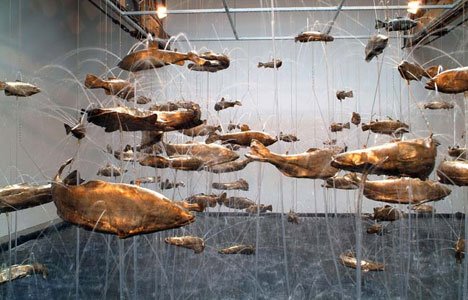

Our first MFA seminar thing was a trip to Beacon, New York, to see the collection of modern art at the Dia museum. It was a pretty good trip, although in all honesty paintings that simply consist of the gessoed surface or just lines are completely lost on me. I am afraid I just do not agree with Greenberg, it's a cool theory and all about the art transcending everyday life by having nothing to do with it, and existing on its own optical plane, but that's just not my taste. I did quite enjoy the sculpture, though. Especially the spider piece by Louise Bourgeois and the fish piece by Bruce Nauman.
Tuesday, October 17, 2006
If you cut me do I not bleed the same red?


 I think I could stand some feedback on these. This is a reductive woodcut I did of Shylock from the Merchant of Venice. These were the best of the ones pulled. Personally I think that just the straight red is the one that actually works the best. Or maybe not, my images always look different to me when I post them. I think that the red works better with the wrinkles, though.
Saturday, October 14, 2006
Madonna Hall

Well it turns out that I may have to find an off campus place by the end of this semester. Madonna Hall where I am currently living has been undergoing extensive construction, and in order to keep on schedule next semester they will be moving us into a hotel, or given the situation I have the option to break contract without penalty.
I have been living here for over a month now and have not described where I am living. The building is still fairly new (built in the 60's sometimes), but the students have not been kind to it. The condition of my walls is really quite atrocious, although I do have permission (since they are tearing it down) to paint my room, too busy though. The vent in my room is ungodly loud, and it is also rather cold at times. They tend to have a hard time heating the third floor, especially now with the construction and the fact that half of the building does not have windows. Lobby wise some of the windows are hanging off, and we also have an elevator that is made out of plywood. Mailbox numbers do not correspond with room numbers, also the floor/wing kitchens do not include refridgerators (neither do the rooms). I should note though that Madonna did win an award for its interior decorating.
Friday, October 13, 2006
Pan God of Dreams
 Alright this is something that I have been playing with. Technique wise this plate has been sawed into, drilled into, line etched, aquatinted, areas carved out with burins, and there is also an attempt at line engraving.
Monday, October 09, 2006
Possible Art Crit Paper Topic

Helen Frankenthaler's wood cut series Tales of Genji may very well be my art criticism research paper topic, or more specifically just the criticism surrounding the series. (God forbid that we actually critique a piece) At anyrate the spontanaity of these images belies the amount of planning that actually goes into them. If I am not mistaken she is averaging around 6 blocks per image. Each block closely examined and chosen for it's wood grain, which she then carves and then paints with watercolor. She is also using a special printing process that is designed to make the colors bleed a little bit. The paper she is using is entirely hand made and designed around the image, and is intended to imitate the color and texture of the wood blocks.
Tuesday, October 03, 2006
Been Awhile
It's been awhile since I last posted, and much has happened. For starters I now have my own studio space up with the MFA painters, it's previous occupant had to leave due to personal complications. I would have to say that it is really quite marvelous having my own space to work in again. It was rather uncomfortable in the printmaking grad studio, I was really the main grad student using it, but I prefer to work in chaos and dirt and Hoffer prefers pristine work areas (i.e. getting oil and what not on the paper protecting the table surface). So this is much better for me, Thank you to Eva and Rob for recommending me for it. There has been talk of a possible trip to Paris this springbreak, so I am going to be looking into loan type things for that.
On the printmaking front my enquiry to the Sharpie company proved ineffectual beyond recieving a "Thank you for liking our product so much." So to all of you printmakers out there using sharpies for etching they thank you. Also I have recently learned about a company, New York Central Art Supply, their paper selection is so huge it has to have it's own seperate 180 page catalog. We are talking things like historically made printing papers out of Spain to embossed paper from India, or Elephant shit paper from Africa. Their web page is http://www.nycentralart.com/
On the printmaking front my enquiry to the Sharpie company proved ineffectual beyond recieving a "Thank you for liking our product so much." So to all of you printmakers out there using sharpies for etching they thank you. Also I have recently learned about a company, New York Central Art Supply, their paper selection is so huge it has to have it's own seperate 180 page catalog. We are talking things like historically made printing papers out of Spain to embossed paper from India, or Elephant shit paper from Africa. Their web page is http://www.nycentralart.com/
Monday, September 25, 2006
The Mystery of the Sharpie Revealed
Alright, well maybe somebody else has already figured this one out, but here is my best stab at it. Lately I have been reading Gabor Peterdi's truly masterfull book on printmaking. In it he mentions using india ink directly on plates to serve as a resist. My guess is that they use india ink in sharpies, and what is india ink (although it's actually chinese, damn imprecise Victorians)? If I am not mistaken one of the traditional main ingrediants of india ink is lampblack, which seems like it would be able to block acid, and also to state the obvious yet again lampblack is the pigment that makes the ink black so it would stand to reason that the red and orange sharpies would not hold up.
Sunday, September 24, 2006
Bad Timing

Alright, well considering the banter that just went on in the last post, this one is probably really inappropriate, but I figured as long as we are on the topic of alcohol to just go with it. This post is for a guy back home, who loves beer, no not in the binge drinking sense of this will solve my problems. Rather he enjoys trying different brands and savoring the differences and highlights in the brew. Well if you are not still upset with me and are keeping up with my blog, the beer in PA is Yuengling, and this brewery is in fact the oldest in the country. I do not think that it would agree with your more sophisticated beer palette, though. Although maybe you have already tried this one.
Friday, September 22, 2006
Richard

Well there is an older gentleman in the graduate printmaking studio class, who goes by the name of Richard. I'll admitt it at first I did not quite know what to make about Richard as he always seemed to be expounding to me about the merits of gloves, and to Hoffer about the hot plate (at which Hoffer would roll his eyes). Well upon the advice of the painting MFA's I sat down and engaged Richard in conversation, and all I have to say is wow. Richard is currently working as a curator at the Steamtown Museum, and is also pursuing his MA in spight of failing eyesight. As a younger man he had lived out west, and freely traversed the art circles out there. In fact he even spent a year working for Richard Royce out in Oregon. Royce was a master printmaker hailing from the Atelier 17 crowd, and had had the title personally bestowed on him by Hayter. Royce was in fact the printmaker that artists such as Judy Chicago, Rauschenberg, and Jim Dine called upon when they needed such services. It was kind of hard to find, but this is one of Royce's prints. It is called Vortex (1980) it is a carborundum etching and measures 28" x 30"; the asking price for this piece is $4500.
Sunday, September 17, 2006
The Invasion of the Blue Hairs (and the public debut of the Friday Night Pokemon Band)
Salut et Bonjour mes cheris et mes ennemis, well it was alumni weekend here at Marywood these past couple days. And these past couple days have been spent trying to dodge alumni demanding to see their old dorm room, and demanding to know what printmaking is and what all of the equipment is for. Oh yes, and also trying to find a space to eat in the cafeteria, as the main sitting area was quarantied off for them. It was really rather unfair, on top of all of this they were serving alcohol at the little alumni gallery show that they were having in the studio building. Now the thing that you have to understand is that Marywood is a dry campus, even if you are 21 you cannot have alcohol, and residents don't even think of coming back home to your dorm if you are drunk (even if you are 21). Well we had been very good sports about dealing with this invasion of alumni, and we felt that we deserved beer. We were however denied, so we decided to try to persuade with a little song. It was at this critical point that we finally learned how to crank the volume on the electric organ (my mistake before about calling it a piano). We went all out, two people playing the organ at once, with beats ranging from samba to disco, and belting out Pokemon as loud as we could. We still didn't get any beer.
Thursday, September 14, 2006
Guerilla Girls
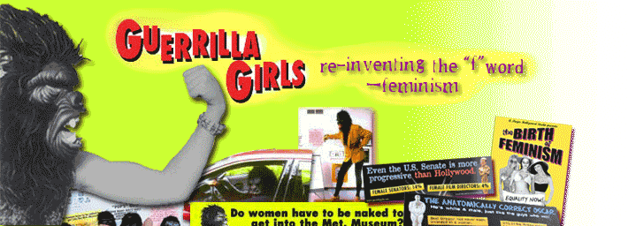
Alright, I have not read any of their books yet, but all female artists should take a look at their web site (just click on the title). No I am not going Feminazi, but it doesn't hurt to be aware of some of this stuff, and they approach feminism through humor anyways. We read about and probably will eventually discuss this group in my art criticism class. To their credit they have actually made the Guggenheim reorganize an exhibition that was originally to be entirely male. Besides print beast... guerillas, do I see a potential conection here.

Sunday, September 10, 2006
The New York Society of Etchers


Well I was just nosing around on the Internet when I happened to come upon this web site. Their roster consists of some very fine printmakers, and it is definately worth a look or two.
For instance these are pieces by Judith Anderson; the bottom one is The Centre Cannot Hold 18 x24", and the top is Bone Woman also 18x24". If I did this right, you should be able to just click on the title of this post to get there.
Saturday, September 09, 2006
The Newest Dance Craze

As of last night I am now a member of the Friday Night Pokemon Band, the other two members are a painting MFA and a guy who works at one of the local museum/galleries. We have decided to put the electric piano thingy sitting in the lobby of studio building to good use, and try to roust our more sober graduate compatriots. Thats right Pokemon, our hearts' are true!

Alright mes cheris, I finally got these scanned and uploaded. All I have to say is that Macs are not my friend, and that in the end I had to admit defeat and go to a lab with IBMs. The image to the left in the corner is my first wood engraving, and is a possible image for a book Simcha and I have been talking about. The image below is my first run through with the ferric chloride as an etching agent. It's not too bad; you actually do have to stack your plates upside down with this stuff,
 or else you have to shake the bath like every 5 minutes. This is due to the fact that this stuff doesn't bubble like the acid does, so the copper that is being eaten away will just settle on the plate and block the ferric chloride.
Thursday, September 07, 2006
A Guest Demonstration in Ebru


Today proved to be a fullfilling day; not only did I meet several of my fellow grad students, but in the process I also got to hear about a demonstration by a gentleman from Turkey. Not being entirely clear on what it was he was going to demonstrate, I opted to go. The mystery deepened upon entering the room and seeing a tray with water, and paints all around it. The demonstrator had been brought into the US by Syracuse University, where he is doing a guest artist thing, and he does not speak a word of English. By now you may be asking what exactly this man's specialty is...well he is a master of Ebru, or Turkish Marbling. Ebru is a technique that was utilized by the Sufi in order to teach patience, and also as a sort of way to get closer to G-d. The paint used is all natural, distilled straight from the earth, the water that is traditionally used is rain water, and somehow cow bile fits into this equation (parts were lost in translation). Anyways how it works is he gently drops some of the paint into water, where it floats on the surface, and he then proceeds to manipulate it into the desired image using a metal awl type tool (didn't get a very close look at it). Then he places a piece of paper on the surface of the water, and gently runs his hand across the back. Of course the image is then on the paper, rather like a monoprint. He also gave a brief demonstration in calligraphy.
If you would like to see or learn more his web page is http://www.geleneksel-ebru.com/
Sunday, September 03, 2006
Discovering the City
 Evidently I better behave here. The picture really does not convey the massiveness of this structure.

I've been walking around a little bit, trying to see what the city has to offer. I would have to say that the architecture here is absaloutly beautiful, and there are some very impressive structures in this town.
The image to the left is the Scranton Public Library, and the building to the right is the Scranton Cultural Center at the Masonic Temple. You can't really see it at all in the picture, but the space above the door (sorry I forgot the term) is carved with a chinese dragon and the Masonic compass; they also shine different colored lights on it. Evidently Staind played there, and Samuel Adams hosts their Oktoberfest celebration from here as well. I'm thinking about seeing if they would be interested in hiring an experienced janitor.
Wood Engravings

Alright, I'm being really slow about getting my own scanned but I thought that I would post a couple from the masters. This first image is the work of Leonard Baskin, who died rather recently in 2000. He was a Jewish atheist; he didn't believe in G-d, but deeply loved and believed in his Yiddish heritage.


These next two are by Barry Moser and are from his Bible series. I believe that he is still living, and other work to his credit are illustrations for Alice in Wonderland and The Strange Case of Dr. Jekyl and Mr. Hyde.
I should also add that most wood engraving blocks are quite small. This is because the carving surface is actually the end grain of the wood that is piece together into blocks. So a block is usually only around 1 1/2"-2" wide by about 3" long. If the artist wants to make images that are larger then they have to lock several blocks together for their image, then carve the individual blocks, and then lock them back together for printing. Unfortunatley I am not sure what the sizes are for the images above.
Subscribe to:
Posts (Atom)