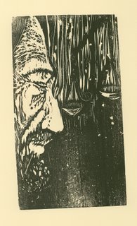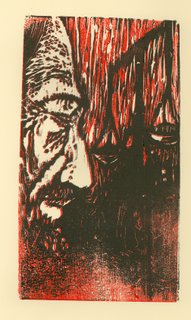


 I think I could stand some feedback on these. This is a reductive woodcut I did of Shylock from the Merchant of Venice. These were the best of the ones pulled. Personally I think that just the straight red is the one that actually works the best. Or maybe not, my images always look different to me when I post them. I think that the red works better with the wrinkles, though.
9 comments:
the second from top down looks like it is the most pronounced..what inks do you use?
Yes, the 2nd from the top offers more texture-more of an ethereal mood to the block. The bottom section of print has equal power as the upper part of the print in this version. The face is excellent. In the other three versions- the face isn't enough to hold the whole design together. The bottom is needing something else...just a little something more to pull it together.
I like the second one from the top too. I like the way the figure and ground are separated from a shadowy dark smudge that leads your eye back to the scales. The red one is too flat.
try using a warmer black or a dark brown for the face.
As I look at them again ,the third one from the top has a different turn to it that has something that could be looked into and see if you could clarify a tiny bit more,just a little bit of a tweek.
I used Van Son Ink on these, it is rubber based ink out of Holland. Thanks for all the input, I really appreciate it.
Wicked print viper.
I actually like the finer lines on the 3rd one.
Content wise I think balanceing the contrast of the black on top and bottom will make it alot stonger. Hello.. bye the way.
Are you doing alot of woodblock now? I see you have a couple posted.
Hey Seth,
Yeah the shop here is really strongest in relief printing, so I'm doing a little bit more of that.
Post a Comment