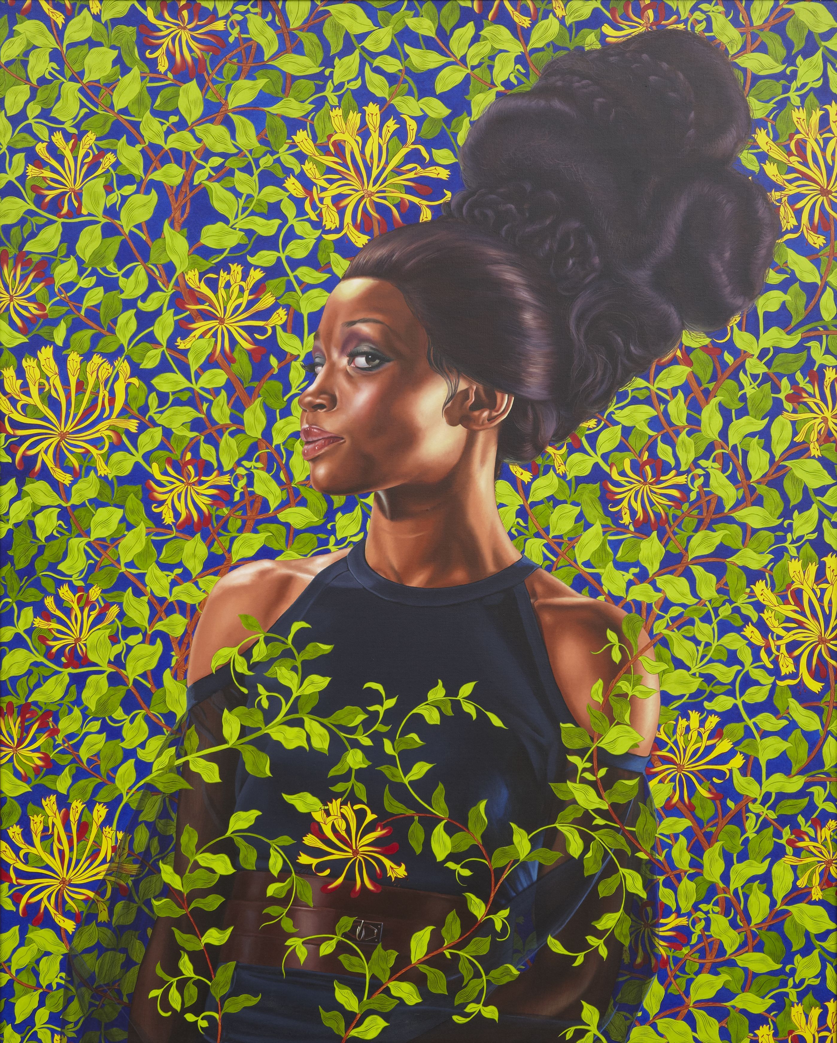
I would like to begin by saying that I do like some of Kehinde Wiley's work. There are some things going on in the president's portrait that were not to my taste. I have seen some very disgusting worthless comments in my facebook feed about this painting, and I hope my criticism does not come off like those comments. Wiley did an excellent job rendering the president, honestly he's a better painter than what I will probably ever be. The thing that gets me is really the lack of negative space. Granted his pieces tend to have intense pattern work, but in other work I have looked at by him there is more spacing in the background pattern work. I also think compositionally that the eye moves that well through it. I mean if you drop thinking that it is the president and plant life, and just look at it as blobs of color. Then you have a reddish brown spot contained largely in a field green, and the brown doesn't really continue anywhere else, so that your eye moves easily around.
 I think Wiley is more successful in this painting. I actually really like Amy Sherald's painting of Michelle Obama. I actually feel like the Obamas were the most elegant first family we have had in recent times. They blow the Trumps out of the water, and they also blew Bush family out of the water. I think the Michelle Obama painting really shows that elegance in its simplicity. Sherald makes excellent use of the negative space. I think she also goes back a little in art history with the big skirt. Lots of paintings of important white women through history with the big skirt. Sherald does this in a very modern way though. Both artists did an excellent job on the paintings. They are both very different from what you expect from pesidential portraits. I don't ever remember presidential paintings getting as much attention as what these have. Nothing but a good thing. I think they got some people who would not normally look at art to look at art.
No comments:
Post a Comment